Now with More Thistling

Well, it’s happened again: The Knitters called, and I picked up!

It’s been a fairly brutal year in the making-ends-meet department, (and I know I’m not alone). So much so that I’ve barely had the heart to knit. I know: hard to believe, and pretty brutal, indeed.

But as always, my Knitters have pulled me down off the ledge. In the wee hours of this morning, a whole lot of you downloaded copies ot the Thistle Stole, for which I thank you, from the bottom of my heart.

This flurry of Thistle-buying reminded me that I have not followed through on my threat to create a Thistle Sweater. A while back, I even selected the winner after auditioning three different yarn lines/pallettes - I just never got off the ground desigining it. So thank you also, for this firm shove back into my Native Habitat/Happy Place. I Hereby Proclaim, it is time to visit an old friend! I give you:

A pink thistle this time! I’m going to start swatching right away, before the start-itis can dissipate. While I’m doing that, I need your help, Gentle Readers.

Your mission, should you choose to accept it, is to vote on the following:

Would you prefer a cardigan silhouette in A) a circular yoke, or B) a drop-shoulder? Leave a comment with your vote, along with any other ideas/requests you have for the new design. Many thanks in advance for your input! Watch this space for the process…

Retail Therapy

Is there any higher form of shopping than yarn selection? I think not. I'm doing the online kind today, which holds its own challenges and delights.

The first challenge is that I can't touch the yarn. Careful checking of the fiber content will be necessary to predict how the yarn behaves, and an element of chance is assumed. The second is trying to see how the colors will behave together, This one is pretty easy: I take screen shots of the yarns I'm considering, and layer them together with the pattern photo (or sketch, if it's my own design). I do this in MS Word or MS Publisher, if you're wondering. Notice how I try to show each color in proportion to how much of it will be used? I've added a 4th contrast color, too, by the way, because I have no self control. I'm thinking to use it in the peerie bands between the knots on the upper body. Or not. We'll see.

55% Merino, 25% Alpaca, 20% Donegal Tweed 

Predictions I can make about this yarn: Alpaca is very soft, as is Merino. So what this yarn lacks in "backbone" it will make up for in drape. The tweedy look feels authentic to the original, if that's what I'm going for. Every color here has the same color "Neps" or tweedy bits (black, white, gray and tan), which will lend the whole piece cohesion when used together. It may also tend to flatten and homogenize the design. The angle of twist here is not as high as I usually prefer for ideal stitch definition, but I can compensate by making sure my color contrast is as high as possible. Maybe switch to Charcoal for the MC?

95% Wool, 5% Cashmere (Actual yarn name is "Debbie Bliss Fine Donegal")

This one is more of a mystery. What kind of wool? Will it be the typical crunchy stuff I usually expect with tweed from the UK? What about the cashmere? Is it really spun into the yarn, or are only the Neps cashmere? I suspect the latter. My intuition tells me this is a sticky, crunchy traditional tweed with cashmere neps, which give it the fantastic color variations. Notice too, that there is barely any twist here: I'd bet it's one of those 2-ply yarns masquerading as a singles, with just enough twist to hold the plies together. A sweater made with this yarn will not be as soft, or as drapey as either of my other two choices. Because there are no purl sts in Stranded Colorwork, I need to be aware that Singles and Singles-type yarns may have a tendency to torque the body tube. Ever have an old t-shirt that has been washed so many times it spirals around the body? That's what happens with singles yarns, if you don't take precautions. These would include knitting at a firmer gauge, adding purl sts, and/or combining other, plied yarns into the design. Adding the center steek will also help, as would some Elizabeth Zimmerman "phoney seams" at the sides, if it really became an issue.

50% Fine Merino, 25% Baby Alpaca, 25% Mulberry Silk

This yarn appeals to me for all the things it isnt: Nuppy, crunchy or matte. Get a load of the shine on it! I also love the high twist in the plies, and the particular iteration of my chosen color scheme. Using this would lose all the the blurry, watercolory qualities of the soft tweed colors, so it's unfaithful to the original concept. But it would have that dreamy sheen, and most likely a lot of drape and softness.  I usually err on the side of more primitive, high-contrast combinations, so this really appeals to me.  Subtle isn't typically my bag. I have to decide whether I prefer to stay true to the original design concept, or branch out and do my own thing. 

Post a comment, won't you, and tell me which of these is your favorite and why?

Uncharted Territory

I had planned to start talking about yarn shopping today, because, well YARN. But I started looking at the original Roan chart and decided I have some preliminary work to do on it. Like, a LOT, to make it into a chart I'd want (or want to let you) knit. And then I realized you might find this part interesting, so I'll show you!

Click to enlarge

Here are the things that would make me hate knitting this chart, as it was originally published:
1.  It's intended to be knit flat. Yup. Our friends in England love stranded colorwork, but they sometimes expect us to knit it flat, which would mean purling back in pattern, which requires us to read our charts in reverse every other row. Eeewwwwww. And stranded colorwork, as a fabric, likes to get really arsed up when it's knit flat, unless you know and implement some pretty extreme maneouvers to compensate. When we knit our stranded colorwork in the round, as God intended,  all these issues are completely erased.

2.  While I'm on the subject (and dangerously close to ranting), I'd like to state for the good of the order: THIS IS STRANDED COLORWORK, NOT FAIR ISLE KNITTING. Sorry for yelling but I would expect the staff of Rowan, who are actually IN Great Britain, to exhibit a better understanding of their own indigenous knitting traditions. They actually call it Fair Isle in the pattern text. It's not Fair Isle unless it obeys these (and other) rules:

A. Fair Isle stranded colorwork is knit in the round. Period.

B. Fair Isle stranded colorwork uses traditional/geographical motifs; nearly always some variation of knots, crosses, and trees of life. None of these are present in Roan.

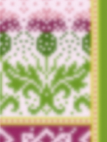
C. Fair Isle motifs share common stitch counts, and/or multiples of those counts, which allow them to stack up upon each other round by round and line up with mathematical precision. Roan contains six different motifs, with no less than six different stitch counts. Not only do they not stack up neatly, they barely all fit into the same sweater at all. More on that as we go along.

D. Fair Isle motifs are nearly always symmetrical, and if not, they are mirrored on the piece. These are neither symetrical, nor mirrored, nor even centered.

3.  There are decreases indicated at the sides of the assumed flat-knit body panels. And they are weird, to my eye. They are only 2 sts each, and occur at odd places on the body (all in the hip area). They also, if worked, would be very disruptive to the charted pattern. So because they would only amount to a collective 3/4" change in the garment circumference, in an otherwise extremely loose-fitting (more on that later) silhouette, I'm eliminating them. I suspect they were added by pattern-grading software somewhere along the line, and not caught by the humans.

4.  All of the pattern bands need to be centered on the center back of the body (look closely at the scrolly thing - it's not), and need to be mirrored (reversed) along a center axis of the body. You may disagree with me on the mirroring, so feel free to ignore this next part: It's my personal preference that stranded colorwork motifs are either symmetrical (like the birds), or if directional, that they reverse direction at the center back, center front, or topline of the sleeve. It's just a thing I'm hyper about, and if you are looking at a collection of my sweaters, you may not notice that this is going on, but I promise you'll notice that they look well thought-out and precisely executed. This is one of the reasons why.

5.  There are some ways that designers can make knitting charts friendly to knitters. The first is to make them digital, so you can mess with them and tweak them just the way you want on your device of choice, or at least easily enlarge them to make it safer for your eyes. So my Roan Retool will be digital. Another thing we should always do for you is use actual colors in the chart, rather than symbols or monotone shading. Same reason: If I want you to continue knitting my designs, I'd better respect your eyesight by drawing a legible chart.

6. This seems like a small thing, but it's not. It's the only reason why I recommend that beginning stranded colorwork knitters start out with my patterns, rather than some other designer's: The Tacking of Floats. A couple of posts ago, I showed you the insides of some stranded colorwork, where you can see that I never ever tack floats (twist one strand around the other). It's the single biggest reason why my knitting seems like cohesive flat fabric, instead of a puckered gauge experiment. Tacking floats causes more problems for new stranded colorwork knitters than any other thing. The best cure is not to do it. So what happens when you are knitting a chart like Roan, that has giant stretches of unused color? Look at the top round of the birds panel: There are actually 63 stitches between uses of the motif color in that repeat. Are you supposed to really have a float of 63 stitches (10 1/2")? No, of course not. It's my job as a designer not to saddle you with a knitting problem like that, built right into the design. I think it's unforgivable when someone does that to knitters. There are three ways to deal with a giant empty patch of unused color in a pattern: 1. Hunt down and throttle the designer. Just kidding. 1. Tack the long float in such a way as to not disrupt the knitted fabric (extremely hard to pull off). 2. Leave an unnaturally long float. I'd call the limit on this something like 10 or twelve sts, and it only works if you are using nice, sticky traditional Fair Isle yarn, such as a 2-ply shetland. or 3. Change the chart so the second color does not go unused for more than a reasonable number of sts. I'm going to go with option 3, so my chart will look somewhat different to the original. If you like the long stretches of negative space, then by all means, tack your floats, or leave them long. You'll be able to compare the original chart to my retooled version when I'm done and make your own decision.

Okay, I'm sure you'll agree that I have some work to do on this chart in order to make myself happy with it, so I'll quit preaching to the choir for now. Here's a screen shot of the chart rework in progress, to give you an idea how I'm doing it:

Click to enlarge

See? I've already fixed the centering problem with the scrolly border, and mirrored both it and the braids. Notice how the braids made little hearts at the center back? Total accident, but I love it. And now the scrolls undulate one way on the left side of the body, and the other on the right. They'll mirror beautifully at the center front, regardless of where your size ends in the chart. Better, no? 

Stay tuned for the big chart reveal, and of course, our favorite: Yarn Shopping!